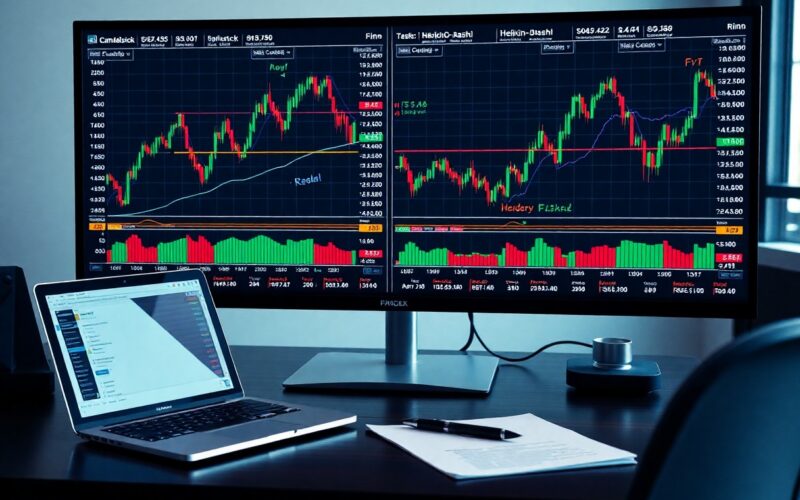
Analysis of different chart types can significantly influence your trading strategies. You might find that Candlestick charts provide detailed information about market sentiment, while Heikin-Ashi charts help smooth out price action for clearer trends. Alternatively, Renko charts enable you to focus solely on price movement regardless of time, reducing market noise. Understanding these various charting techniques can enhance your decision-making process and offer a comprehensive view of market dynamics.
Understanding Chart Types
Charting is an necessary skill for traders, as it enables you to visualize trends, assess market conditions, and make informed decisions. Different chart types cater to various analytical approaches and personal trading styles. Understanding their characteristics allows you to select the most effective chart type for your trading strategy.
| Chart Type | Main Characteristics |
|---|---|
| Candlestick | Displays open, close, high, and low prices; often used for detailed market analysis. |
| Heikin-Ashi | Smoothens price data; helps in identifying trends more clearly. |
| Renko | Focuses on price movement; eliminates time aspect for clearer trend visualization. |
| Line Chart | Simple representation of closing prices; effective for long-term trends. |
| Bar Chart | Shows price range for each period; useful for understanding volatility. |
Importance of Charting in Trading
The ability to read and interpret charts effectively can lead to more successful trading outcomes. With accurate charting, you can pinpoint entry and exit points, identify potential reversal zones, and manage risk effectively. Chart types help you visualize different aspects of the market, aiding in your analysis.
Charting also offers insights into market psychology, revealing trader sentiments and trends. By analyzing charts, you can adapt your strategies according to market fluctuations, ensuring that your trading remains responsive to real-time changes. This ability to pivot based on visual data strengthens your trading decisions.
Overview of Different Chart Types
Each chart type serves a unique purpose, and its effectiveness can vary based on your trading style and goals. For instance, candlestick charts provide rich information for day traders looking for short-term movements, while line charts are suited for long-term investors focusing on historical trends. Understanding the specific benefits of each chart type allows you to tailor your analysis.
| Chart Type | Ideal User |
|---|---|
| Candlestick | Day traders and short-term investors. |
| Heikin-Ashi | Trend-following traders. |
| Renko | Traders focused on eliminating noise. |
| Line Chart | Long-term investors. |
| Bar Chart | Traders assessing market volatility. |
- Candlestick charts reveal price action dynamics.
- Heikin-Ashi charts smooth out normal price movements.
- Renko charts focus purely on price shifts.
- Line charts simplify data visualization.
- Bar charts show potential price ranges effectively.
Any trader can benefit from identifying which chart type aligns with their trading strategy, as this can significantly affect trading performance and outcomes.
Candlestick Charts
Definition and Features
Candlestick charts provide a visual representation of price movements over a specific time frame, offering information about opening, closing, high, and low prices. Each candlestick consists of a body and wicks, with the body indicating the price range between opening and closing. If the closing price is higher than the opening price, the body is often filled or colored green; if it closes lower, it is typically red. This color-coding allows you to quickly assess market sentiment at a glance.
One of the most notable features of candlestick charts is the ability to identify patterns that may indicate future price movements. Patterns such as doji, hammer, and engulfing can signal potential reversals or continuations in trends. With hundreds of recognizable formations, you can glean insights into market psychology, enhancing your trading strategy with informed decisions.
Interpretation of Candlestick Patterns
Understanding candlestick patterns is fundamental to extracting trading signals from these charts. Specific formations can indicate market reversals or the continuation of trends. For instance, a ‘hammer’ pattern often suggests a potential bullish reversal after a downtrend, while a ‘shooting star’ indicates possible bearish sentiment following an uptrend. By observing these patterns, you can improve your timing and make more effective trading decisions.
Moreover, candlestick patterns can be analyzed in conjunction with other indicators or previous price action to increase their reliability. For example, if you observe a bullish engulfing pattern followed by a strong volume spike, this confluence may signal a higher probability of a price increase. Therefore, integrating candlestick patterns within your broader analytical framework can enhance your trading performance.
Advantages and Disadvantages
Candlestick charts offer several advantages. Their intuitive visual design allows you to digest complex information at a glance, making them user-friendly for both beginners and experienced traders. Additionally, the plethora of patterns available provides rich opportunities to identify market trends and turning points, thereby aiding in precise entry and exit strategies.
On the downside, interpreting candlestick patterns requires a degree of skill and experience. Not all patterns are reliable in every market condition, leading to potential false signals. Moreover, the effectiveness of candlestick patterns can diminish in volatile or choppy markets, where price movements may not follow established patterns. Therefore, it is vital to incorporate comprehensive analysis techniques to mitigate these risks.
Understanding the balance of advantages and disadvantages ensures you leverage candlestick charts effectively while minimizing the pitfalls associated with pattern recognition. Recognizing that patterns can fail underscores the importance of setting appropriate stop-loss orders and maintaining disciplined risk management practices.
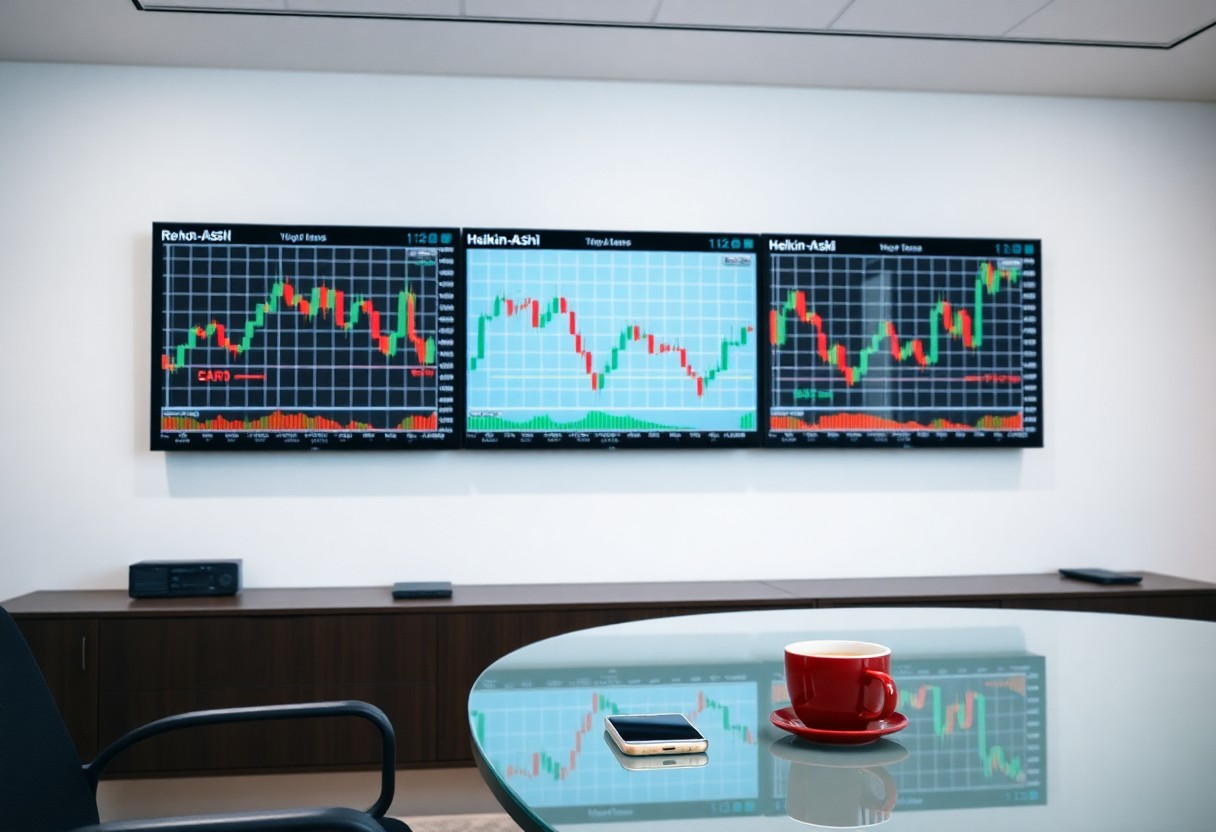
Heikin-Ashi Charts
Definition and Features
Heikin-Ashi charts are a type of candlestick chart designed to filter out market noise and provide a clearer view of price trends. The term “Heikin-Ashi” translates to “average bar” in Japanese, reflecting their calculation method, which uses averages of current and previous prices. This unique approach creates a smoother visual representation that helps you identify trends more effectively and reduces the influence of short-term price fluctuations.
Unlike traditional candlestick charts, Heikin-Ashi charts use modified calculations for open, close, high, and low prices. For instance, the Heikin-Ashi close is the average of the current open, high, low, and close, while the Heikin-Ashi open is the average of the previous Heikin-Ashi open and close. This averaging technique results in candles that visually depict ongoing trends rather than focusing on individual price movements.
How Heikin-Ashi Differs from Traditional Candlestick Charts
One primary distinction between Heikin-Ashi and traditional candlestick charts is how they represent price movements. In a standard candlestick chart, each candle reflects the exact price action within that timeframe, giving you a precise view of the market’s behavior. In contrast, Heikin-Ashi charts smooth out these fluctuations, making trends more apparent, which can be particularly advantageous in volatile markets.
Another difference lies in the interpretation of bullish and bearish signals. Regular candlestick charts may show multiple signals indicating reversals or consolidations in a trend, while Heikin-Ashi can help filter out these signals to present a more dominant trend direction. As a result, you might find it easier to stay aligned with the prevailing market movement, minimizing the chances of premature entries or exits.
Advantages and Disadvantages
Heikin-Ashi charts offer several advantages, such as improved trend identification and reduced noise. These charts are ideal for traders seeking to ride longer trends without getting distracted by small price movements in between. Additionally, the smoother visual appearance allows for easier assessment of market strength, which can facilitate better decision-making in your trading strategy.
However, there are also disadvantages. Since Heikin-Ashi calculations are based on averages, you may encounter a delay in signaling market reversals when compared to traditional candlestick charts. This could result in late entries or exits, ultimately affecting your profitability. Moreover, the lag in current price reflection might not suit day traders who rely on immediate price action.
Use Cases for Heikin-Ashi
You can effectively employ Heikin-Ashi charts in various trading strategies, particularly trend-following approaches. By utilizing these charts, you can spot and ride trends with greater success, reducing the emotional stress associated with jittery price movements. This aspect makes Heikin-Ashi popular among swing traders and those engaging in positional trading over longer timeframes.
Moreover, Heikin-Ashi can be combined with other indicators, such as moving averages or Fibonacci retracement levels, to enhance your analysis. This versatility allows you to customize your approach further, applying Heikin-Ashi to specific market conditions while drawing upon classic technical analysis tools to bolster your trade setups.
Renko Charts
Definition and Features
Renko charts are unique in their construction, focusing solely on price movement rather than time and volume, making them an excellent tool for identifying significant trends. They utilize ‘bricks,’ which are formed only when the price exceeds a predetermined range, effectively filtering out minor price fluctuations and market noise. This ability to smooth out volatility allows you to spot clear directional trends, enhancing your decision-making process.
You’ll notice that the bricks are either white (or green) for upward price movements or black (or red) for downward movements. This simplicity helps in visually assessing market momentum and pinpointing potential entry and exit points. Unlike traditional candlestick charts, Renko charts do not display gaps or time as a variable, shifting the focus directly on price action.
How Renko Charts are Constructed
To construct Renko charts, you start by determining the ‘brick size,’ which is the price movement that will trigger the formation of a new brick. For example, if the brick size is set to $1, a price movement of $1 will create a new brick, while any price movement within that range will not alter the chart. This mechanism allows for a cleaner representation of trends without the clutter of minor fluctuations.
The process begins with the initial price, and as prices fluctuate, bricks are drawn above or below the previous brick based on upward or downward movements respectively. Conversely, if price movements fall within the set brick size, no new brick is added. This characteristic makes the Renko chart particularly effective for traders who seek decisive trend signals.
Moreover, unlike other chart types, Renko charts can remain unchanged during periods of inactivity, preserving the integrity of visual signals. This makes them a preferred choice for long-term traders who prioritize significant price displacement over short-term market noise.
Advantages and Disadvantages
One of the key advantages of Renko charts is their ability to clearly illustrate trends while eliminating minor price movements that can lead to confusion. This makes them particularly effective for identifying support and resistance levels. Additionally, the straightforward design allows you to quickly gauge market sentiment, which is important in making timely trading decisions.
However, there are disadvantages as well. Since Renko charts do not consider the time factor, you may miss crucial opportunities occurring during consolidations or uneven movements, where price changes might occur without a corresponding new brick being formed. This can lead to delayed responses in fast-moving markets.
The reliance on price movement can also mean that breaking news or impactful events may not be accurately reflected until a significant price change triggers a new brick formation. Such limitations highlight the need for you to complement Renko charts with other analytical tools for a well-rounded approach.
Best Strategies for Using Renko Charts
To maximize the potential of Renko charts, consider using them in conjunction with other technical indicators such as moving averages or momentum indicators. For instance, you can use a simple moving average to confirm the trend direction indicated by the bricks. If the bricks are predominantly green, and the moving average also shows an upward trend, the probability of a sustained upward move increases.
Additionally, implementing a strategy based on the breaking of previous brick patterns can result in high-probability trades. For example, if the price breaks through the top of a series of bricks, it can signal a valid entry point to capitalize on potential upward momentum. It’s important to set appropriate risk management measures, such as stop-loss orders, to protect your capital as trends unfold.
Combining Renko charts with support and resistance levels can help you determine optimal entry and exit points, allowing for a more strategic approach to risk and reward within your trading plan.
Other Chart Types
- Line Charts
- Bar Charts
- Point and Figure Charts
- Range Bars
- Comparison of Unique Features and Uses
Line Charts
Line charts are one of the simplest and most widely used types of charts. They plot closing prices over time, making it easy to visualize trends in the market. By connecting a series of data points with a line, you can quickly identify price movements and patterns.
Unlike other chart types, line charts focus exclusively on the closing prices, eliminating the complexity of open, high, and low prices. This makes them particularly useful for identifying long-term trends rather than short-term fluctuations, which can often mislead untrained eyes.
Bar Charts
Bar charts represent price movements through vertical bars, each depicting a specific time frame. Each bar shows the open, high, low, and close (OHLC) prices, providing a comprehensive view of price action during that period. This allows traders like you to gauge both the direction and momentum of the market.
Each bar’s length and position give insights into market volatility and trader sentiment. You can quickly assess whether buyers or sellers are in control by examining the lengths of the bars and their positions relative to the open and close.
Moreover, bar charts can indicate market trends more clearly than line charts by highlighting price ranges. The openness and closure of bars serve as visual cues for potential reversal points in the market.
Point and Figure Charts
Point and figure charts focus primarily on price movements without factoring time intervals. You will notice that they use Xs and Os to represent price increases and decreases, respectively. This method filters out market noise, emphasizing significant price changes and trends instead.
One primary benefit of point and figure charts is their ability to highlight support and resistance levels. By using boxes to track price changes, you can identify when prices break through these levels, which might indicate a shift in market trends.
Additionally, this chart type significantly reduces the volume of data you need to analyze. When you focus solely on price movements, it becomes easier to spot potential trading opportunities without wading through unnecessary data.
Range Bars
Range bars are another distinctive chart type that allows you to focus on price movements while excluding time altogether. Each bar is created based on a specific price range rather than being time-based, meaning a new bar is only formed when a predefined price movement occurs. This can help you visualize price volatility without getting distracted by time constraints.
This method can enhance your analytical capabilities, as it reveals price action trends in a cleaner format. If you’re looking for clear entry and exit points, range bars can highlight significant price changes that might require your attention.
With range bars, you’ll gain clarity on market volatility and movements. By isolating price activity, you can make informed trading decisions without external noise affecting your judgment.
Comparison of Unique Features and Uses
| Chart Type | Features |
|---|---|
| Line Charts | Simple visualization of closing prices, ideal for long-term trends. |
| Bar Charts | OHLC representation, shows market volatility and sentiment. |
| Point and Figure Charts | Price movements only, highlights support and resistance levels. |
| Range Bars | Price action focused, excludes time, ideal for spotting volatility. |
| Comparison | Diverse uses, each chart type offers unique insights into market behavior. |
Lastly, understanding the comparison of different chart types allows you to choose the right tools for your trading style. Each chart serves a unique purpose and can provide insights that cater to your specific trading strategies.
| Aspect | Insights |
|---|---|
| Price Action | Line charts focus on closing prices while bar and range charts provide comprehensive views. |
| Market Trends | Point and figure charts excel at filtering out noise for trend analysis. |
| Volatility Measurement | Bar and range charts highlight volatility, critical for risk management. |
| Support/Resistance | Point and figure charts explicitly outline key levels for traders. |
| Long-term vs Short-term | Select the appropriate chart type based on your trading timeframe. |
Assume that you regularly analyze multiple chart types. By integrating their strengths into your trading strategy, you can develop a richer understanding of market dynamics and make informed trading decisions.
Practical Applications and Strategies
Selecting the Appropriate Chart for Your Strategy
You must choose the right charting technique based on your trading style and objectives. Candlestick charts excel in providing clear visual cues for price action, making them effective for short-term trading and identifying patterns like pin bars or engulfing candles. In contrast, Heikin-Ashi charts can help you smooth out market noise, which is useful for trend identification and long-term trades.
For those employing a trend-following strategy, you might prefer Heikin-Ashi or Renko charts. These reduce false signals and help you stay in trades longer. If your approach focuses on specific price levels and breakouts, traditional candlestick charts could serve you better, enabling quick decisions based on support and resistance levels.
Combining Different Chart Types for Better Insights
Blending chart types can enhance your market analysis. For example, you might start with a candlestick chart for initial market assessment and then switch to a Renko chart to filter out noise and focus purely on the trend. This approach allows you to align your entry and exit points more effectively, reducing the risk of overtrading.
When using multiple charts, consider timeframes. For instance, employing a longer timeframe such as a daily chart in conjunction with a 1-hour Renko chart can help you identify significant market movements while making timely trades. This combination often results in more accurate predictions and better trade outcomes. After gathering insights from different charts, your decision-making process becomes more robust.
- Market analysis can be enhanced through combined approaches.
- Entry and exit points become clearer with multiple charts.
- Noise reduction is achieved by filtering through different types.
- Trade outcomes can be improved by identifying trends without distractions.
- After observing chart changes, align your strategies accordingly.
| Chart Type | Best Use Case |
| Candlestick | Short-term trading and patterns |
| Heikin-Ashi | Trend identification |
| Renko | Noise filtering |
| Line Chart | Long-term market trends |
To enhance your trading strategy, consider how each type of chart complements your methods. By utilizing different charts, you equip yourself to tackle various market conditions with greater resilience and adaptability. After integrating insights from multiple sources, your overall trading confidence will likely improve.
- Enhanced strategy can arise from combining insights effectively.
- Adaptive trading ensures responsiveness to market shifts.
- Confidence in decision-making grows through comprehensive analysis.
- Long-term success hinges on mastering chart combinations.
- After refining your approach, you can better manage risks and opportunities.
| Chart Combination | Benefit |
| Candlestick + Renko | Focus on trends and patterns |
| Heikin-Ashi + Line Chart | Long-term trend clarity |
| Renko + Candlestick | Fine-tuned entry points |
| Multi-timeframe Analysis | Comprehensive market view |
Common Mistakes to Avoid
Many traders overlook the significance of selecting the right chart for their specific strategies. Using a Renko chart when short-term trading is at play can lead to missed opportunities, as this type is largely suited for filtering out noise and focusing on trends. Additionally, failing to combine insights from different chart types might limit your understanding of market dynamics.
Another common error is relying too heavily on one chart type, leading to oversights in critical price movements. For instance, you may miss volatile price shifts by solely depending on a Heikin-Ashi chart, which could prevent timely entries or exits. Expanding your toolkit and remaining flexible with your chart preferences is vital for success.
Common oversights such as focusing solely on one chart type may severely limit market insight, resulting in poor trading decisions. This underscores the value of diversifying your charting strategy and remaining adaptable to the market’s evolving nature.
To wrap up
Drawing together the various chart types such as Candlestick, Heikin-Ashi, and Renko reveals distinct advantages that can enhance your trading strategies. Each chart type serves different purposes: Candlestick charts provide detailed price action, Heikin-Ashi smoothens trends for clearer visualization, while Renko charts help eliminate market noise, allowing you to focus on genuine price movements. Understanding these differences will empower you to choose the most suitable chart type that aligns with your trading style and objectives.
As you dive deeper into your trading journey, evaluating how each chart type can complement your analysis will lead to more informed decisions. Utilizing the right charting technique not only improves your ability to interpret market conditions but also enables you to effectively manage your trades. Stay open to experimenting with various options to find what best suits your needs and enhances your overall trading performance.